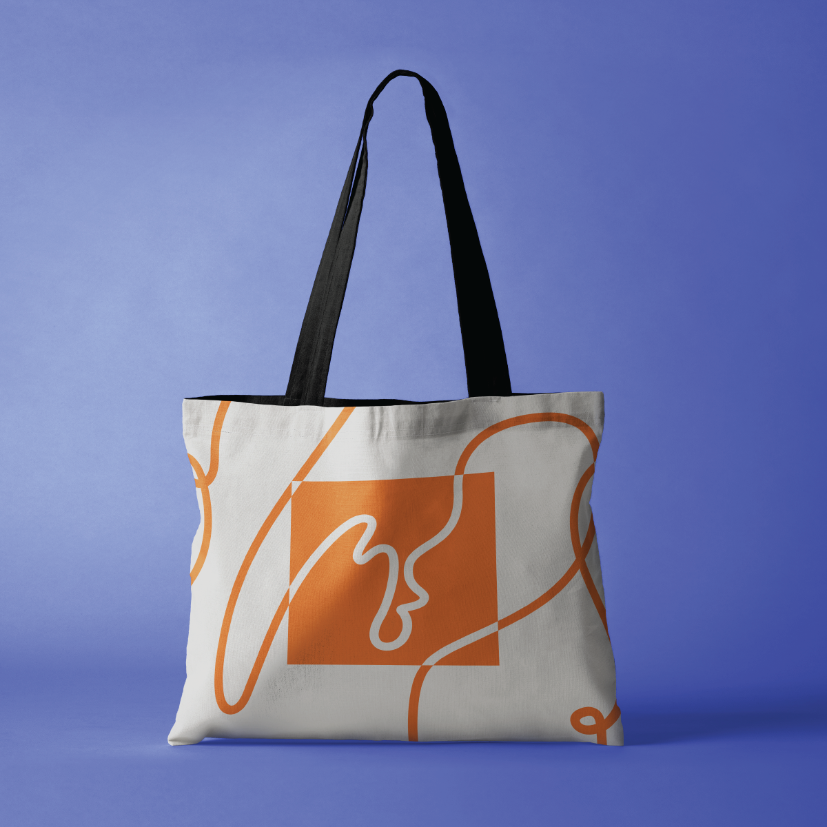
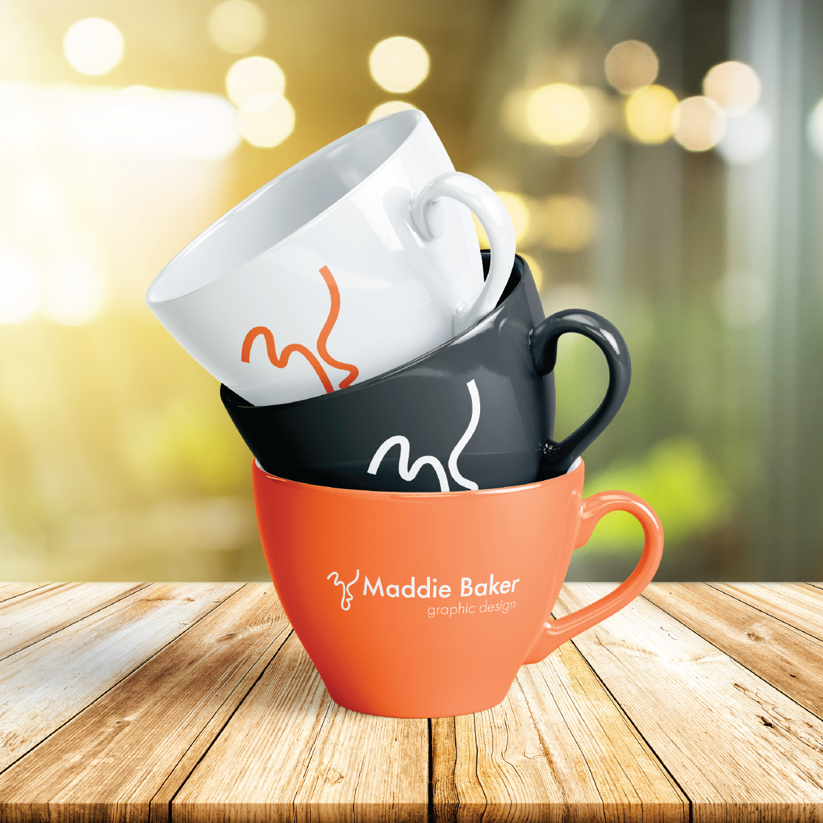
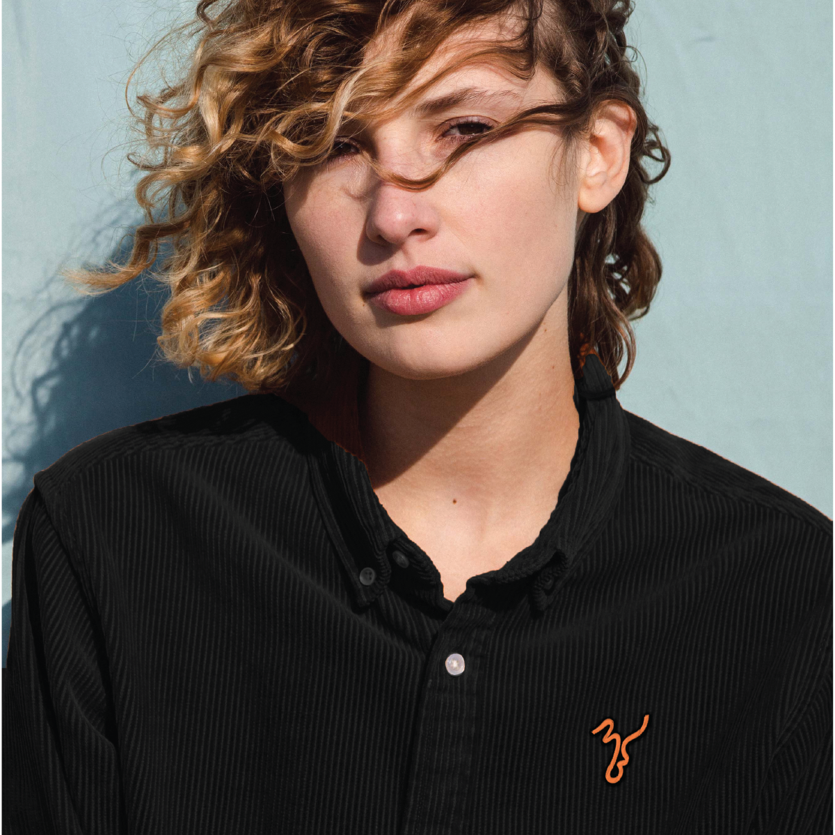
Personal Brand Identity
Developing my personal brand identity. I wanted to create a visual system that is an honest representation of my values and personal style as a graphic designer.
Design Process
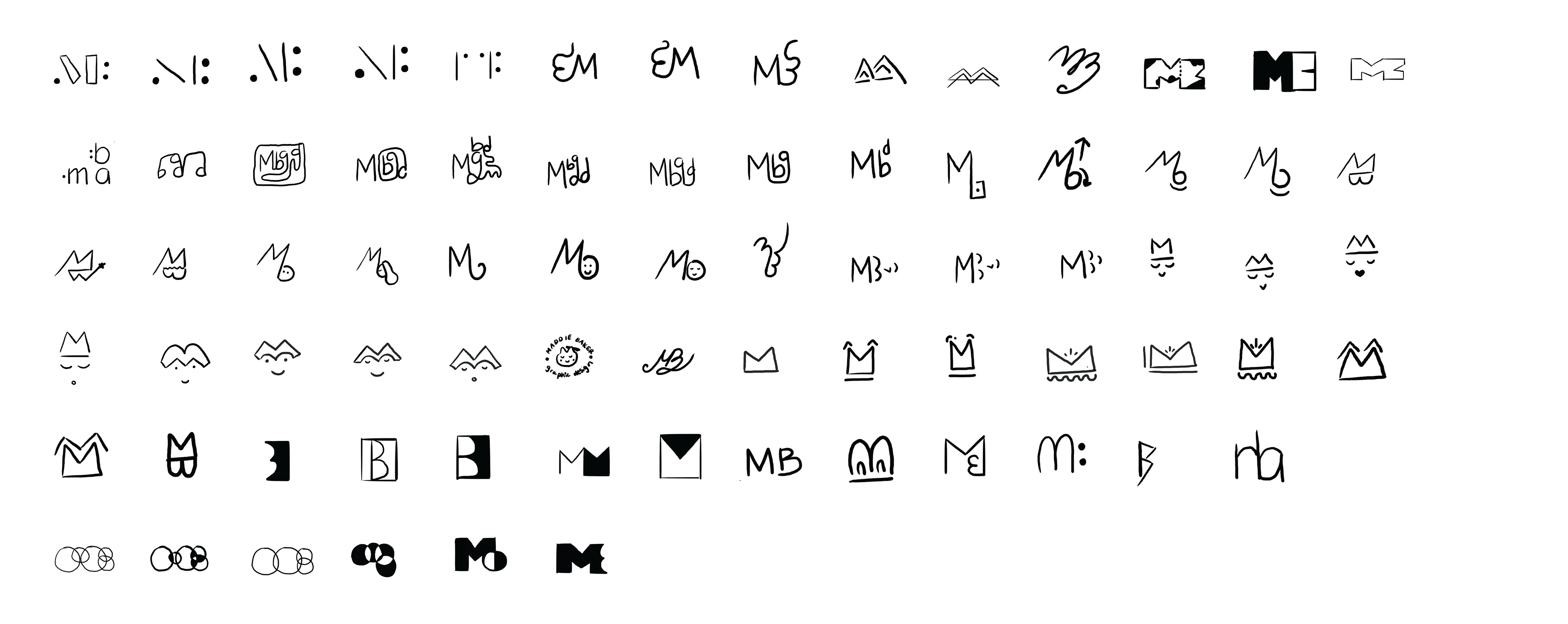
Initial Sketches
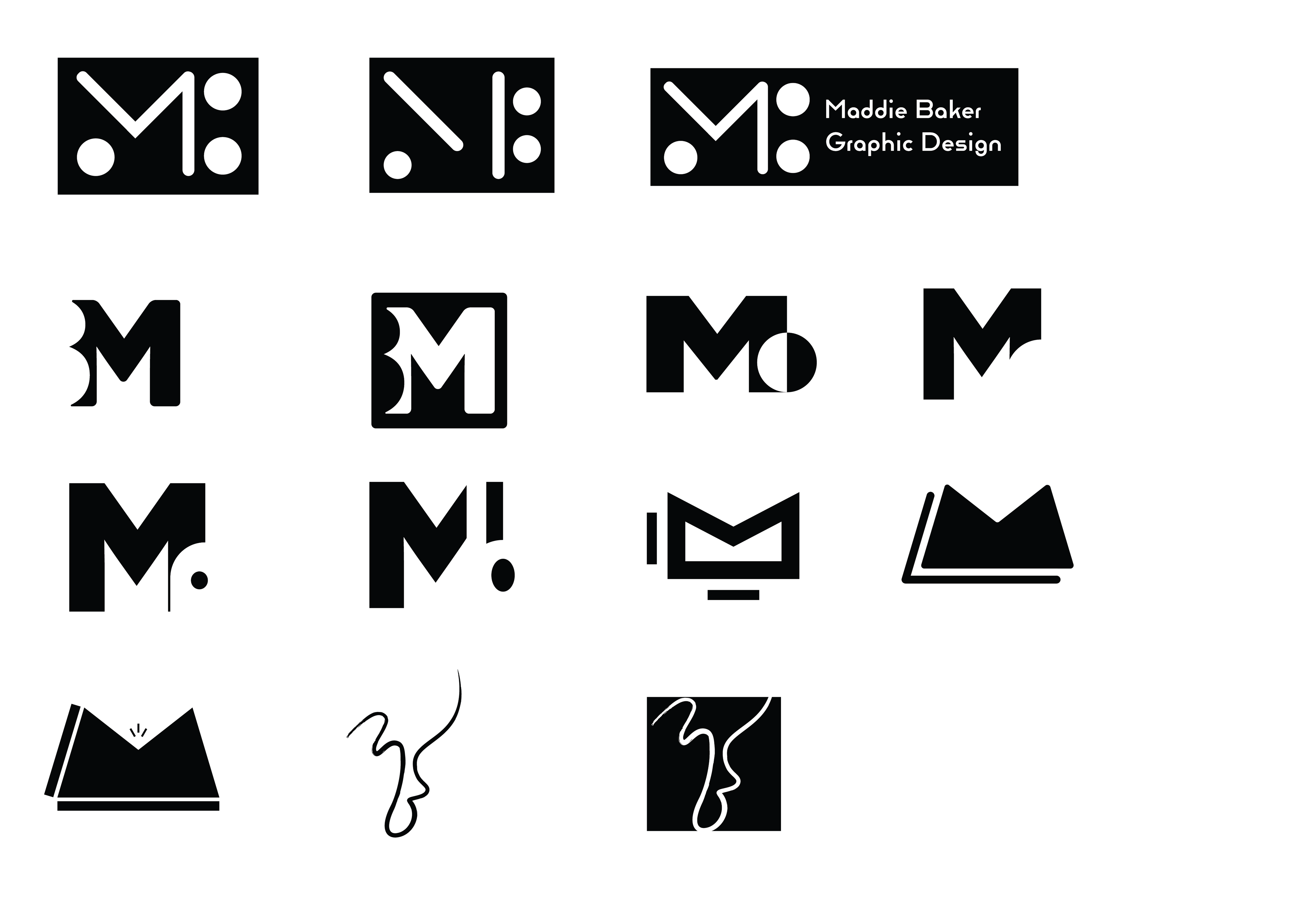
First Round of Digital Drafts
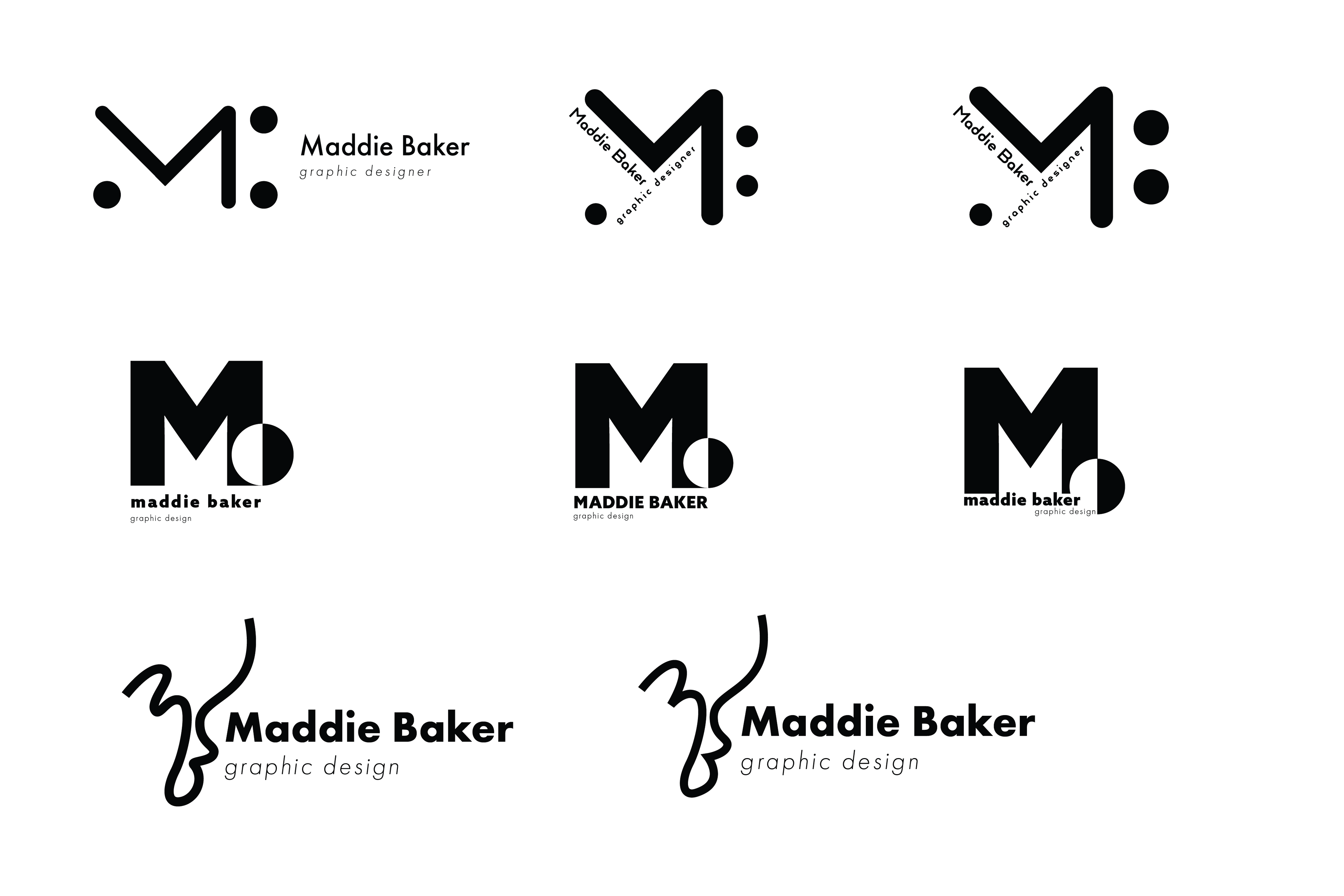
Second Round of Digital Drafts
Final Draft - Initial Logo Choice
Final Draft - New Logo Choice
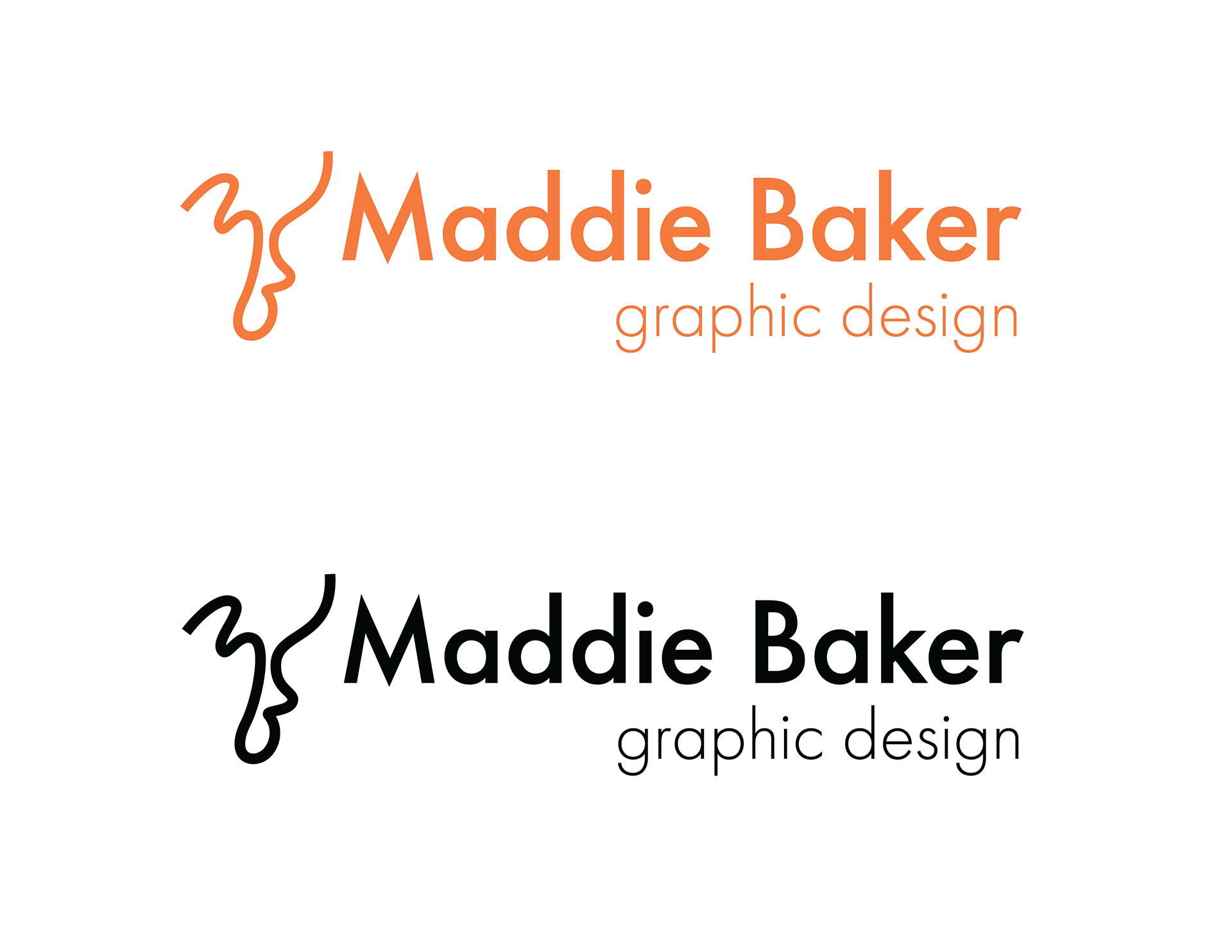
Final Lockups
Color and Typography
A vibrant orange expresses optimism, warmth, compassion, and joy. Nasturtiums are also a flower representing conquest and a creative spirit.
Solid black is grounding and strongly contrasts the bright orange and white hues. Black sesame is an earthy, nutrient-dense seed that also represents immortality and strength.
Just like clean sheets, white is refreshing and has a clean, calming appearance. White also creates negative space and balances out the otherwise highly saturated color palette.
Each color is named after some of my favorite things that bring me comfort and joy. My garden's nasturtiums, black sesame paste pastries, and a clean bed.
I chose Futura to represent my brand because it is a clean, modern, geometric typeface. It is one of the most popular fonts because of its readability, versatility, and simplicity. Nonetheless, it has a positive and bold tone that fits well with my brand's design style.
Futura PT
Medium/Book/Light
Aa Bb Cc Dd Ee Ff Gg Hh Ii Jj Kk Ll Mm Nn Oo Pp
Qq Rr Ss Tt Uu Vv Ww Xx Yy Zz
1234567890!@#%^&*()?
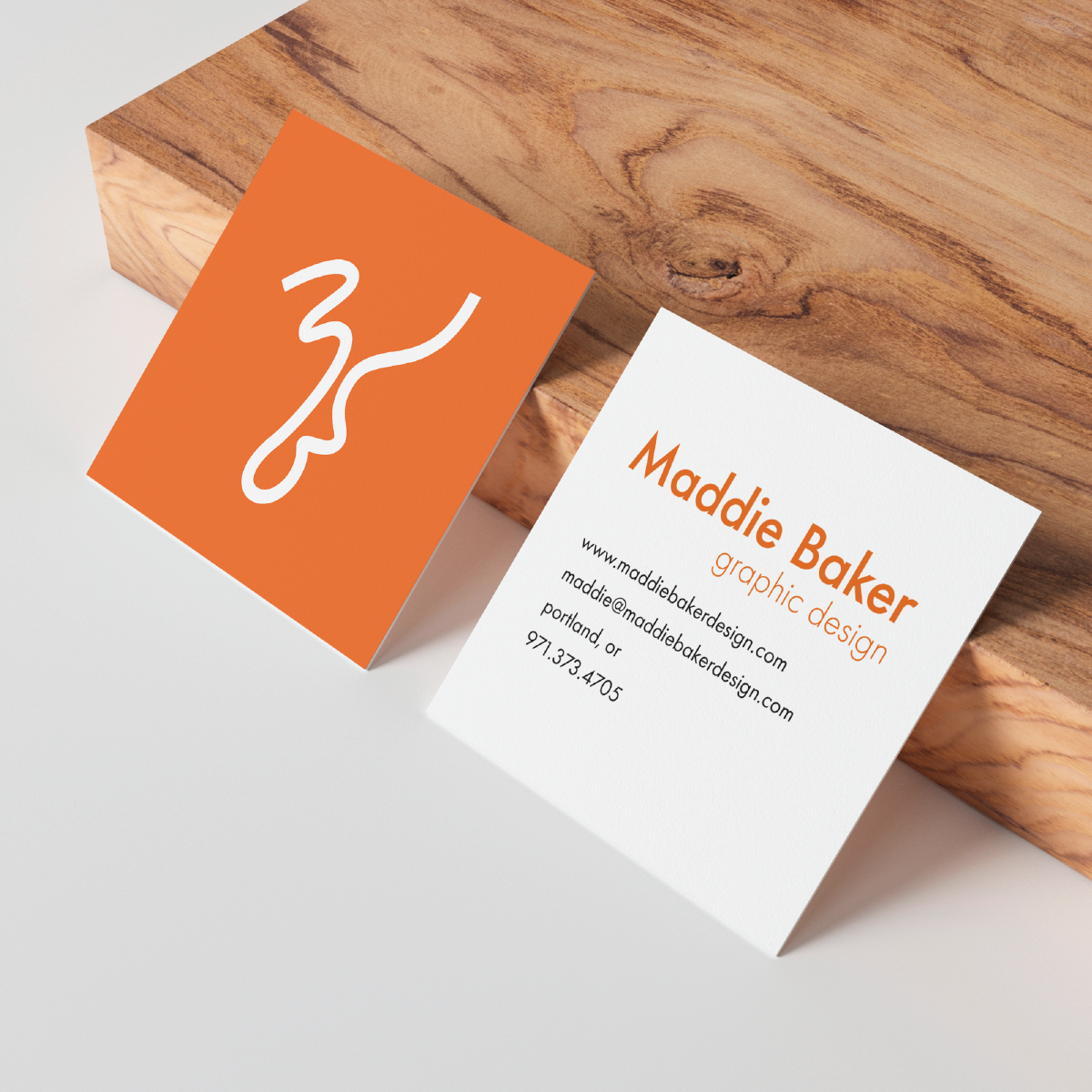
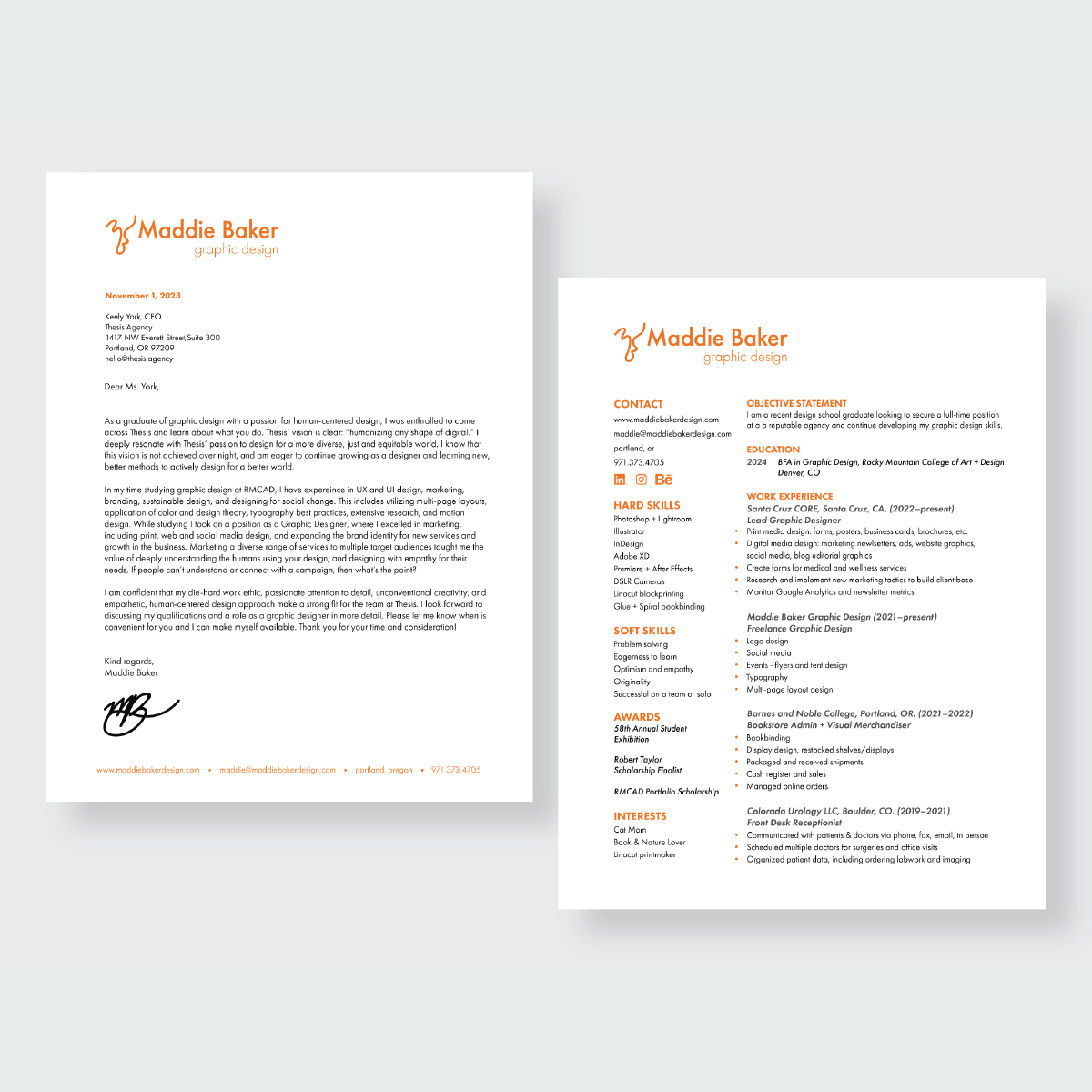
Mockups
