Santa Cruz METRO - UX and Rebranding
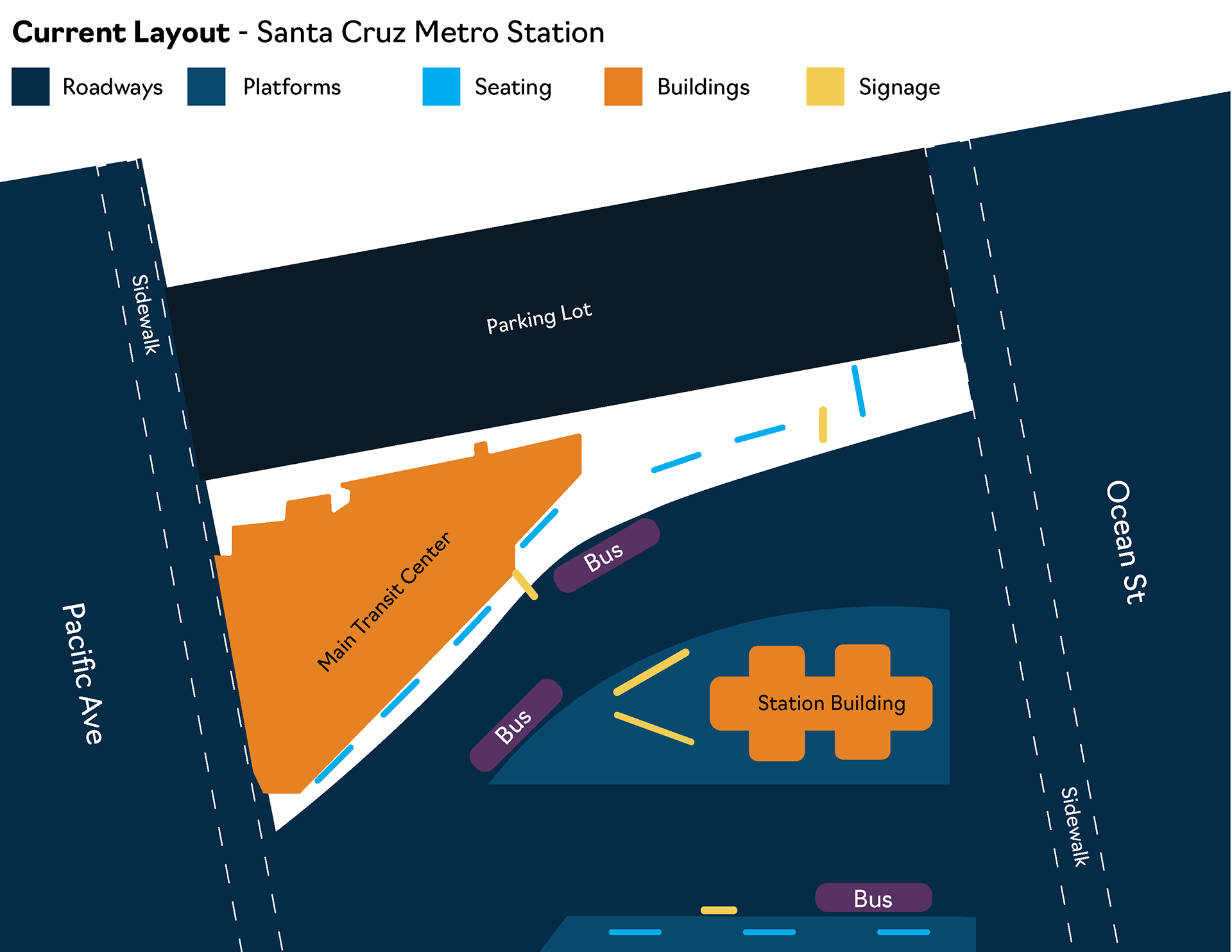
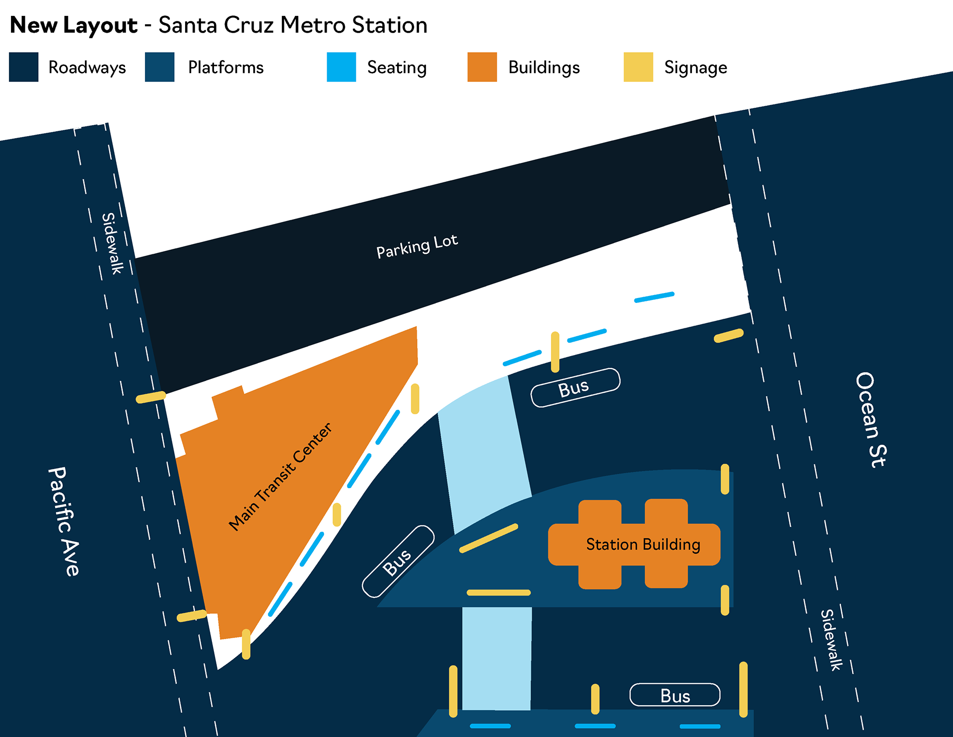
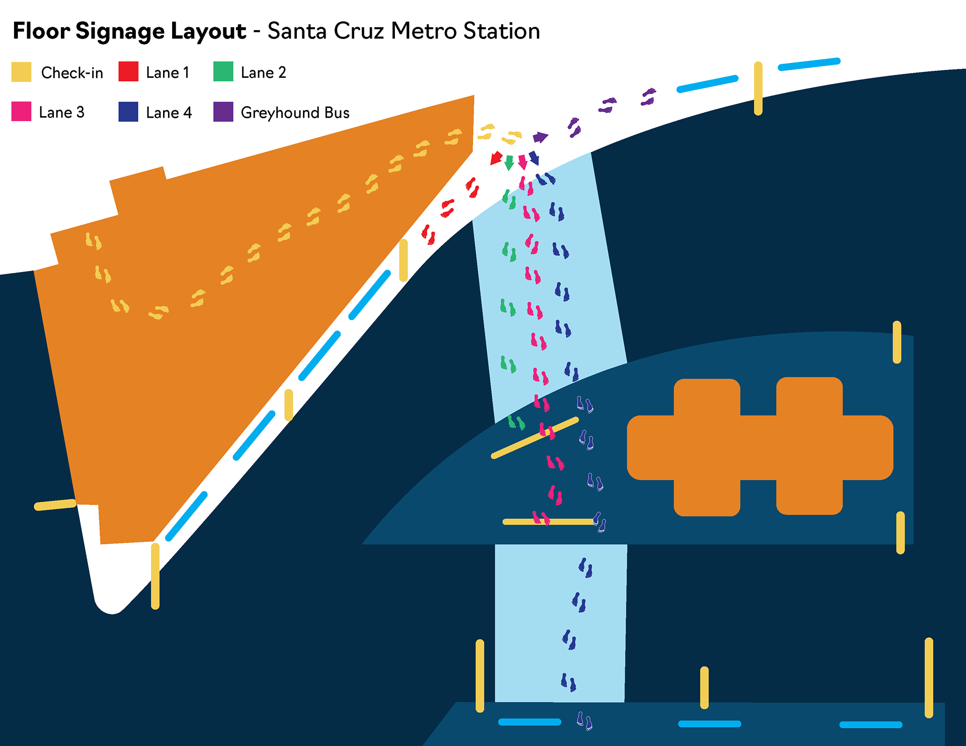
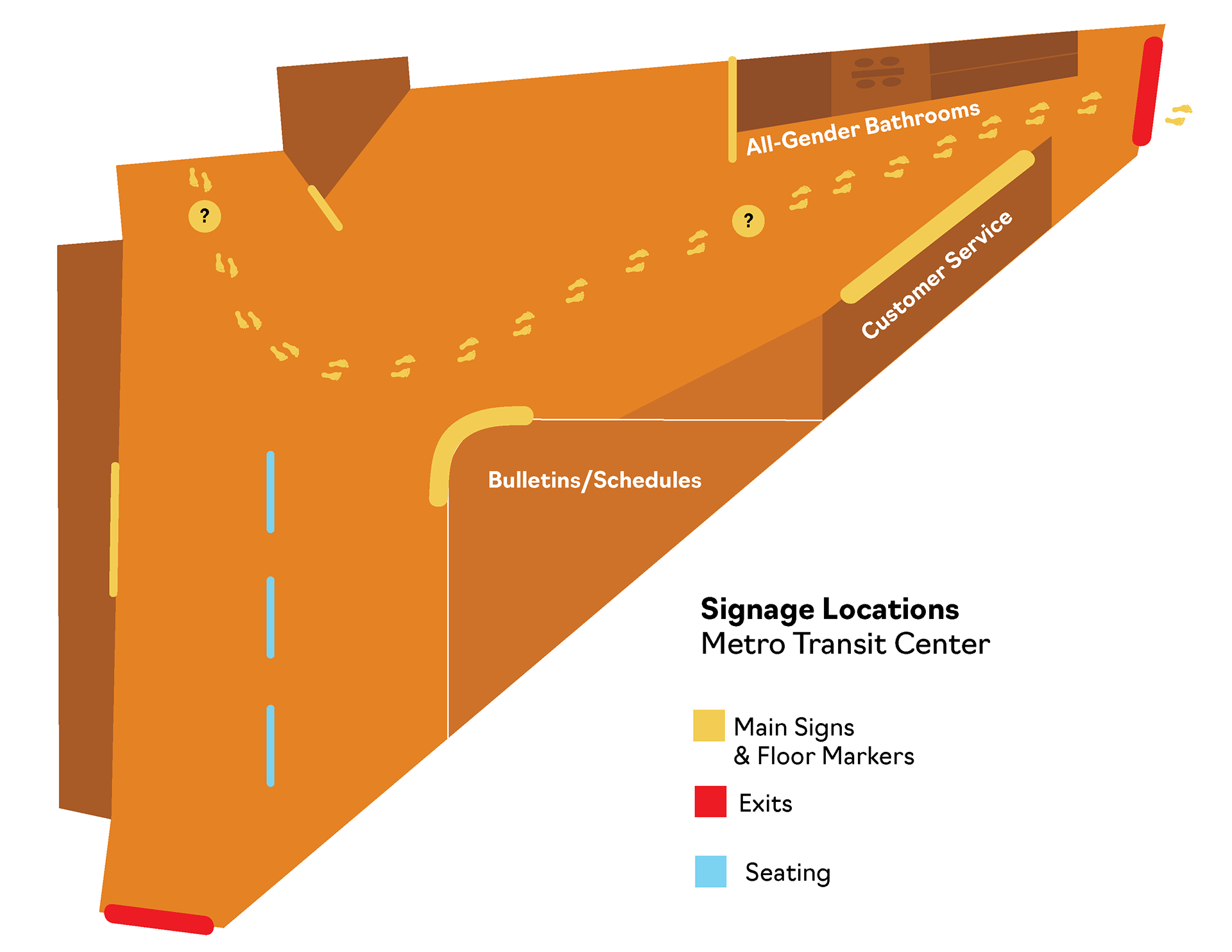
For this project, I was challenged to improve the user experience for a local transit station, Santa Cruz METRO. In addition to the experience design, I also rebranded SCM, bringing it into a more modern space and improving consistency across all platforms.
Design Process
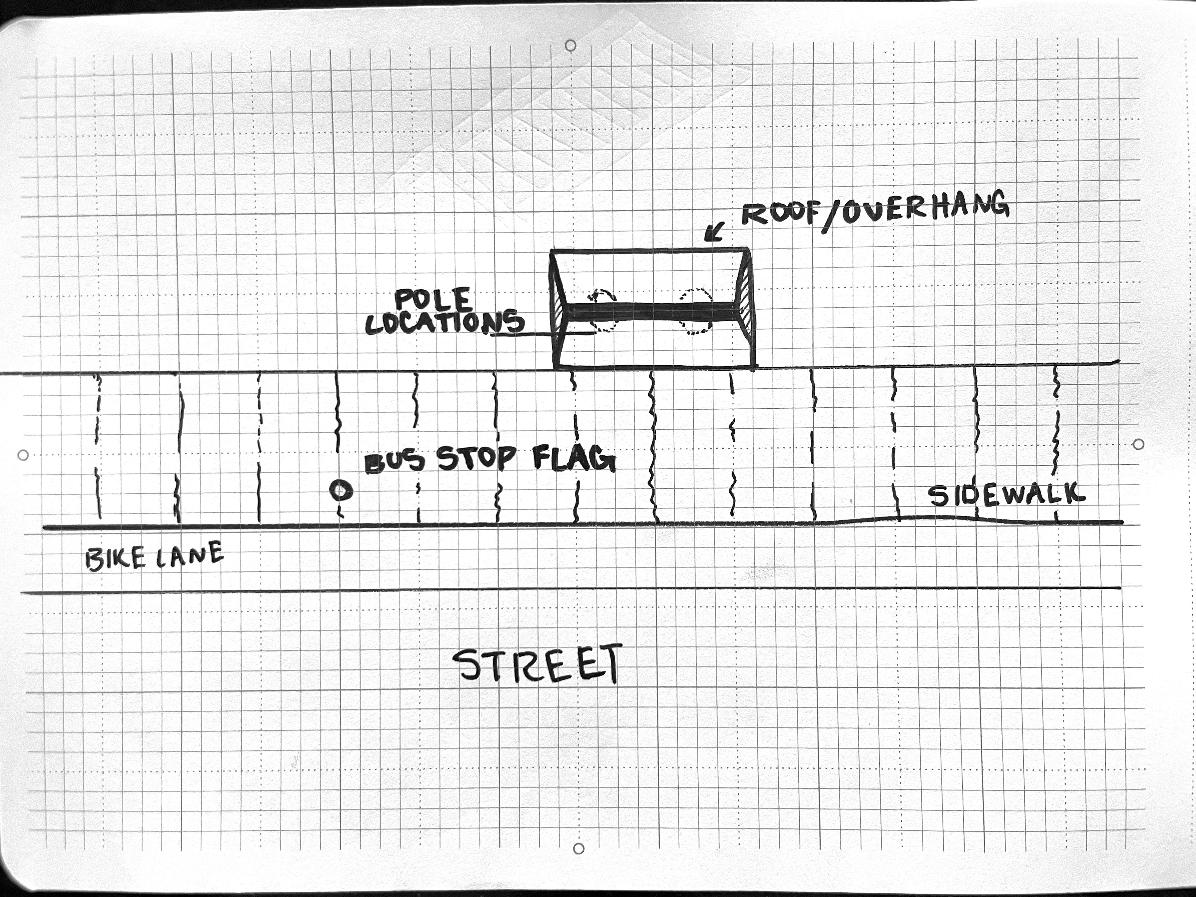
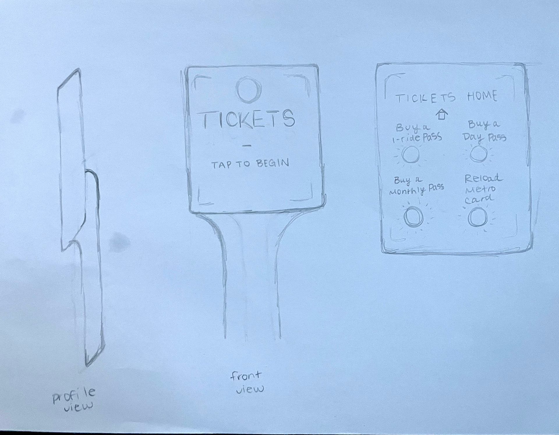
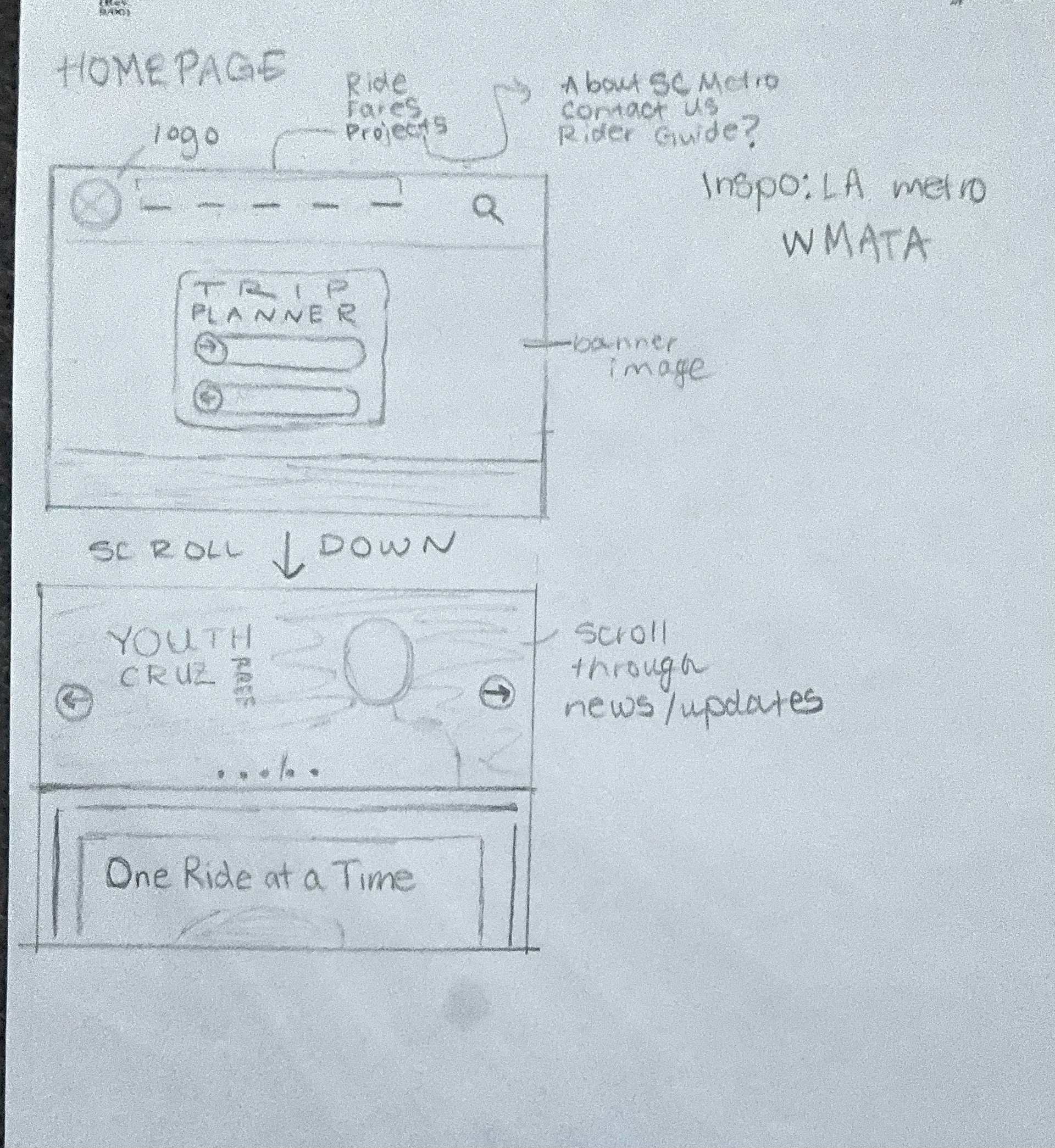
Sketches + Digital Drafts

Logo Development
Color and Typography
I didn't stray too far from the existing color palette. The rebrand still feels familiar to users, and the current colors are representative of the Santa Cruz landscape. Blue skies, sunny days, beaches, and wildlife. Each new color has been named after an endangered or at-risk species in the Monterey Bay, to support SCM's One Ride Initiative.
Navigo is highly readable, legible, and simplistic. This makes it ideal for reading up close, at a distance, or quickly in passing (in a busy bus station). In fact, it was made for wayfinding. Navigo was designed by Ilya Ruderman & Yury Ostromensky with CTSM fonts, for us in the Moscow City District Identity.
Iconography
Before and After
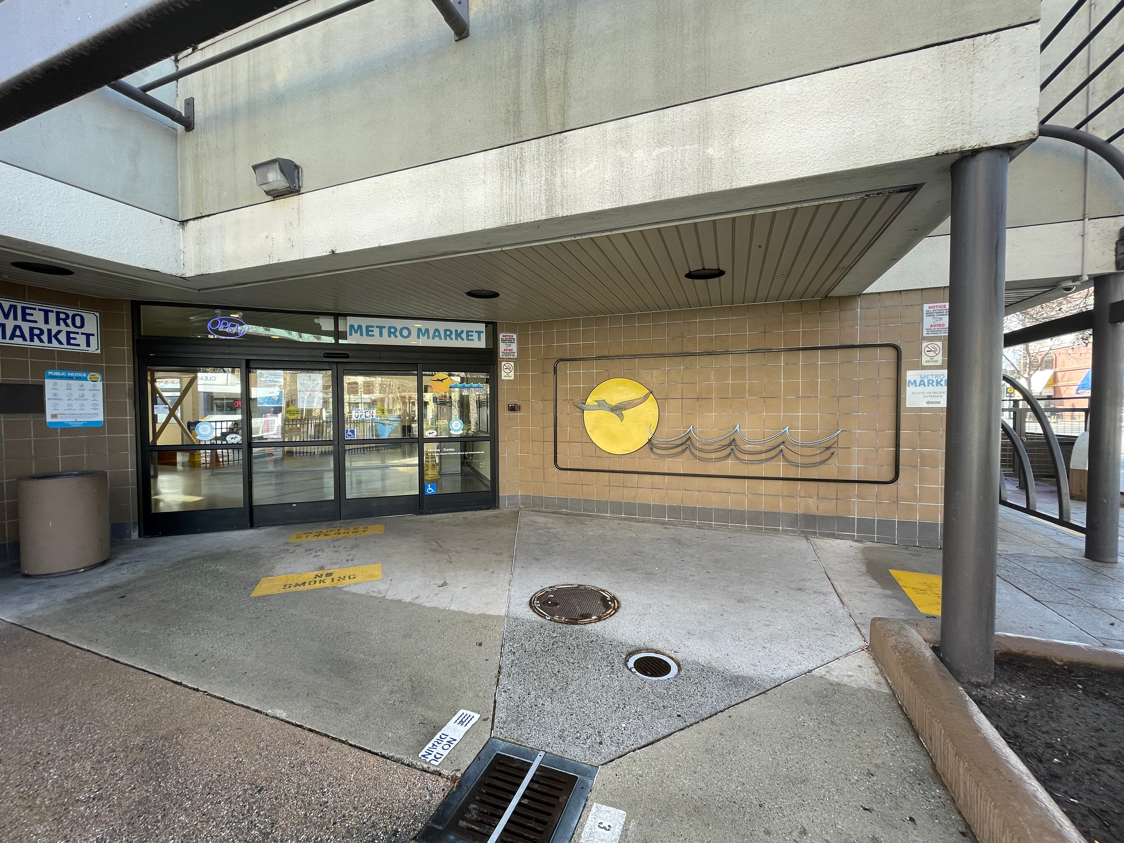
Exterior - Before
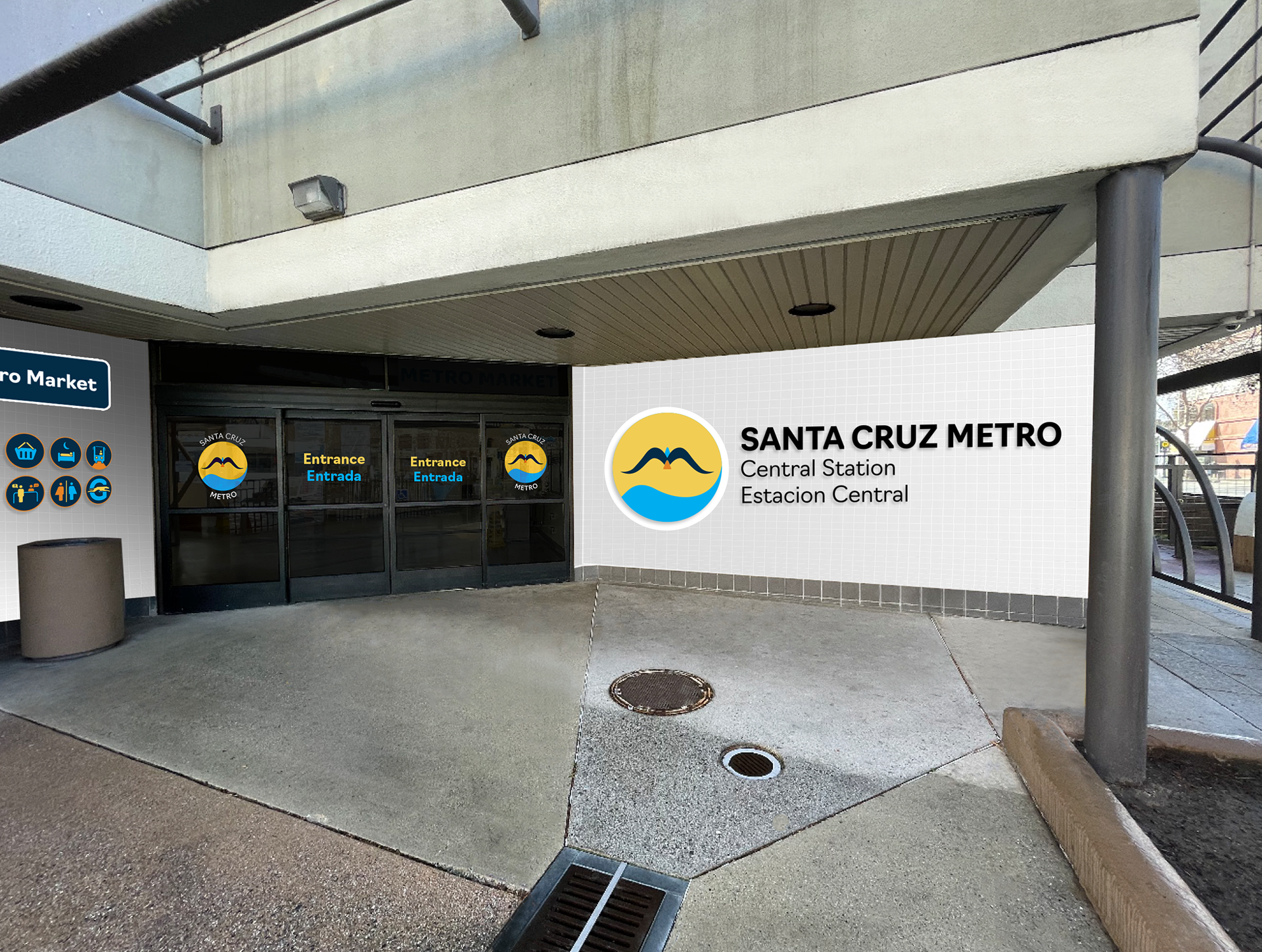
Exterior - After
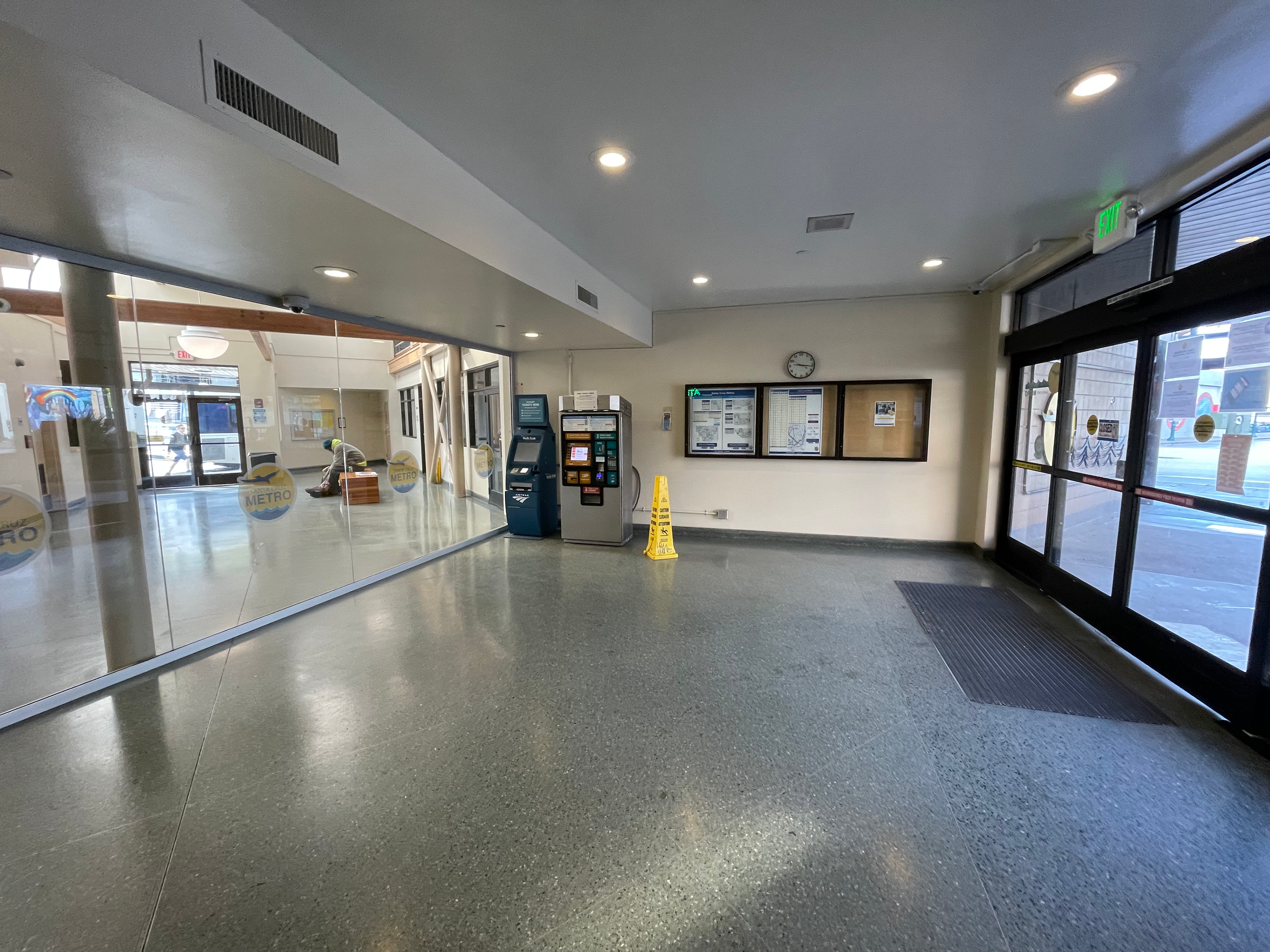
Ticketing Stations - Before
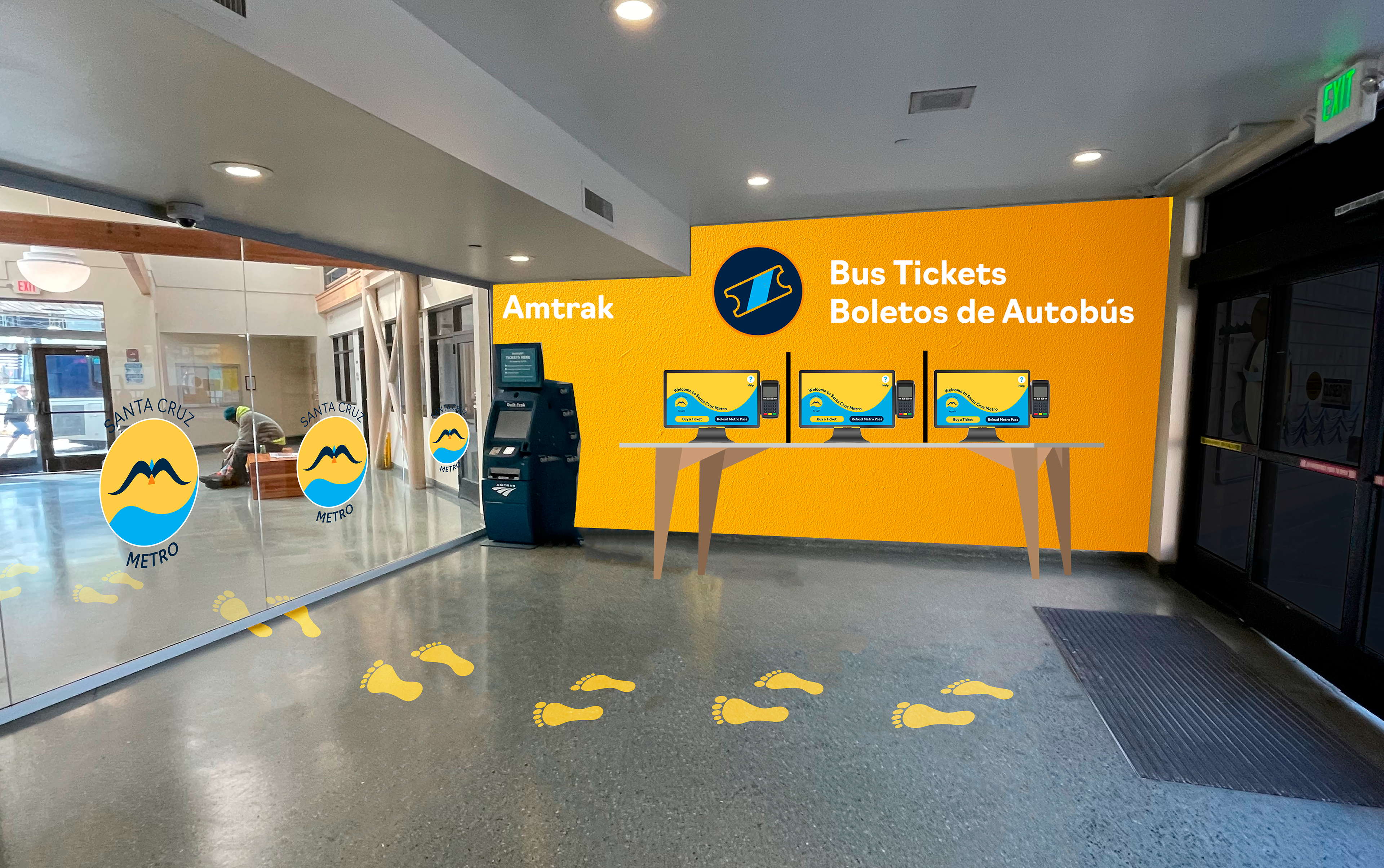
Ticketing Stations - After
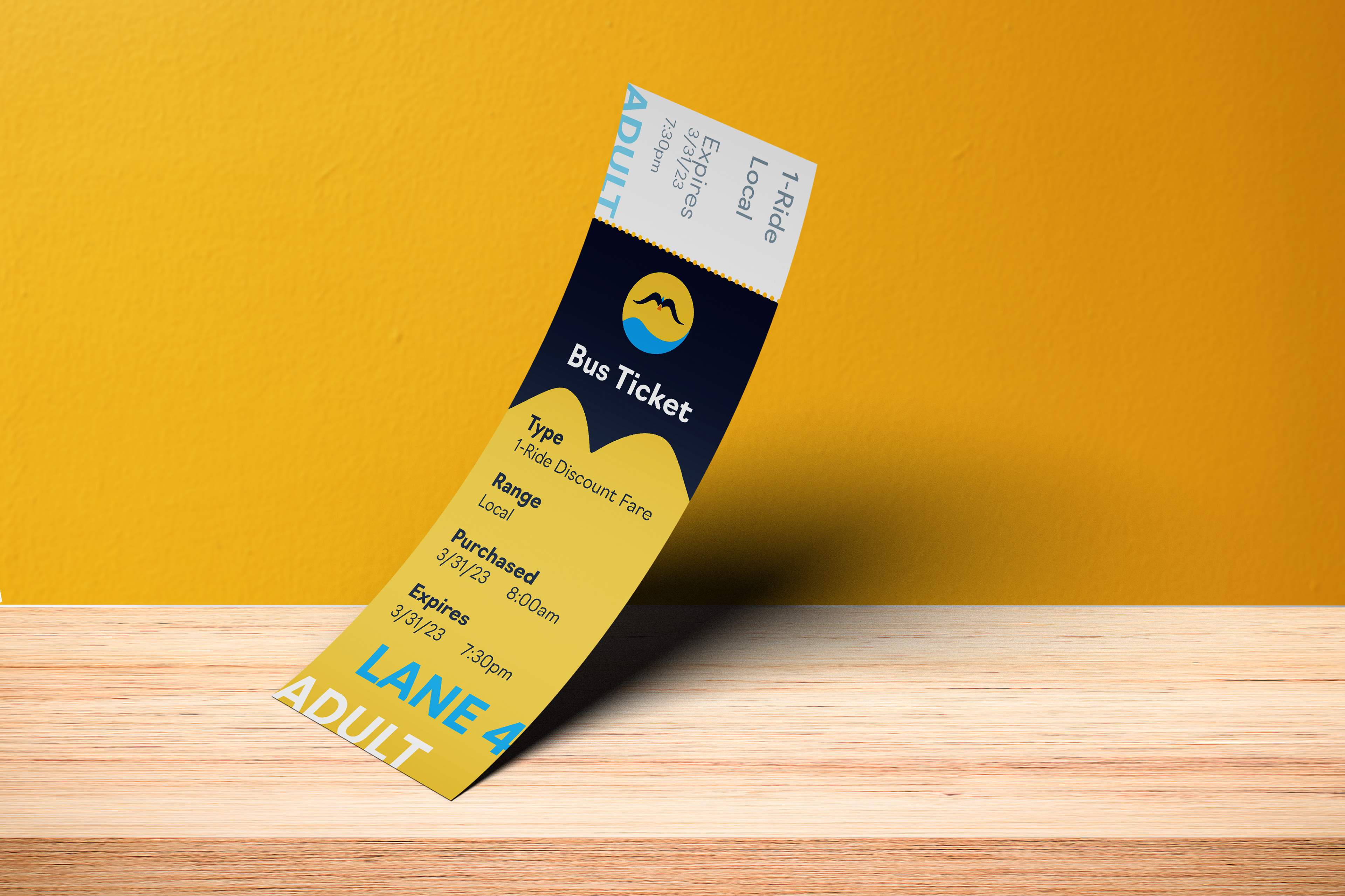
Ticketing


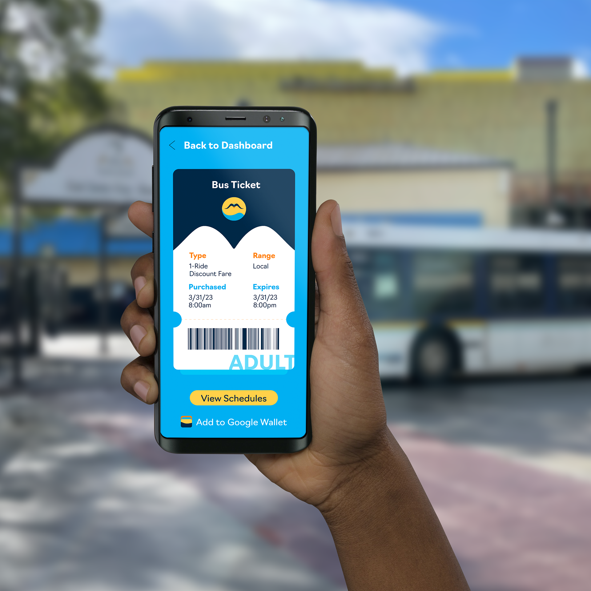
E-tickets can be accessed online, or QR code on the back of the physical ticket.
